
Enhance the Value of Your Acquia DAM Dashboard
The first thing users see when they log in into Acquia DAM (Widen) is the dashboard. As the homepage for your digital asset management (DAM) site, the dashboard is the gateway to your digital content and sets the tone for your user experience.
Dashboards are comprised of three main features, in any combination: dashboard messages, spotlight searches, and saved searches. Admins are able to control the placement of these tools and customize the overall design to help users find what they need with minimal effort.
In this article we’ve rounded up some noteworthy examples of Acquia DAM dashboards to showcase best practices, creative thinking, and what’s possible for your own dashboard design.
See examples from:
350.org
Clio
McCormick & Co.
Rainbow Tree
Progressive Insurance
350.org

350.org is a global grassroots movement focused on solving the climate crisis. Their DAM dashboard takes advantage of all three main dashboard elements: messages, spotlight searches, and spotlight collections.
The first dashboard message is the large, bold graphic across the top of the page, that clearly reflects the company’s mission and brand. The two additional rows of dashboard messages — across four columns — provide quick links to key resources and popular searches. This is followed by spotlight searches and spotlight collections. Combined, these features provide clear, effective ways for users to find the assets they need, with a single click.
Clio

Based in Denmark, Clio provides creative e-learning solutions for children across the globe. With over a hundred thousand assets in their DAM system, they rely on their dashboard to help users connect with the content they need, easily.
Dashboard messages are used to display links that filter content by language or subject, and graphics that link to popular searches. Further, Clio created messages that are only visible to certain user roles. Here we see the admin dashboard, with links to frequently used admin tools in the colored rectangular boxes. This kind of customization helps ensure that the dashboard is relevant and useful for a range of different kinds of users.
McCormick & Co.
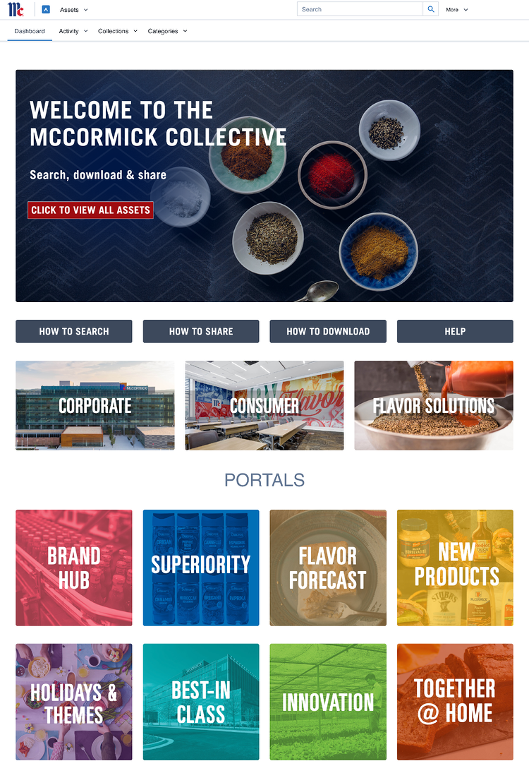
McCormick manufactures, markets, and distributes spices, seasoning mixes, and condiments to the entire food industry. Their DAM site relies heavily on portals to organize and curate content for their global users. Links to specific portals are featured in their dashboard messages, along with popular resources like how-to guides. Further, their use of vibrant photography and graphic overlays creates a design aesthetic that’s beautiful, cohesive, and on-brand.
Rainbow Tree
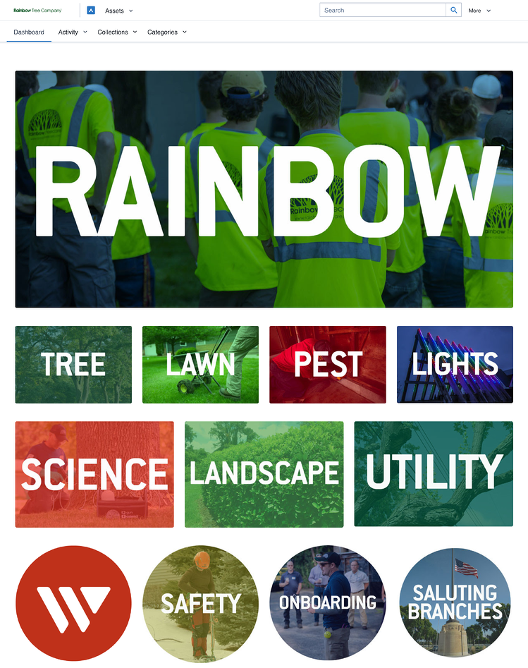
Based in Minneapolis, MN, Rainbow Tree provides a full range of science-based lawncare and pest control services. The combination of photography, graphic overlays, and bold typography on their dashboard creates a clean and unified design that reflects their brand. Each tile in their dashboard messages use deep links to take users directly to a specific area in the DAM site. So with one click, users are able to access a specific category, collection, or saved search.
Progressive Insurance
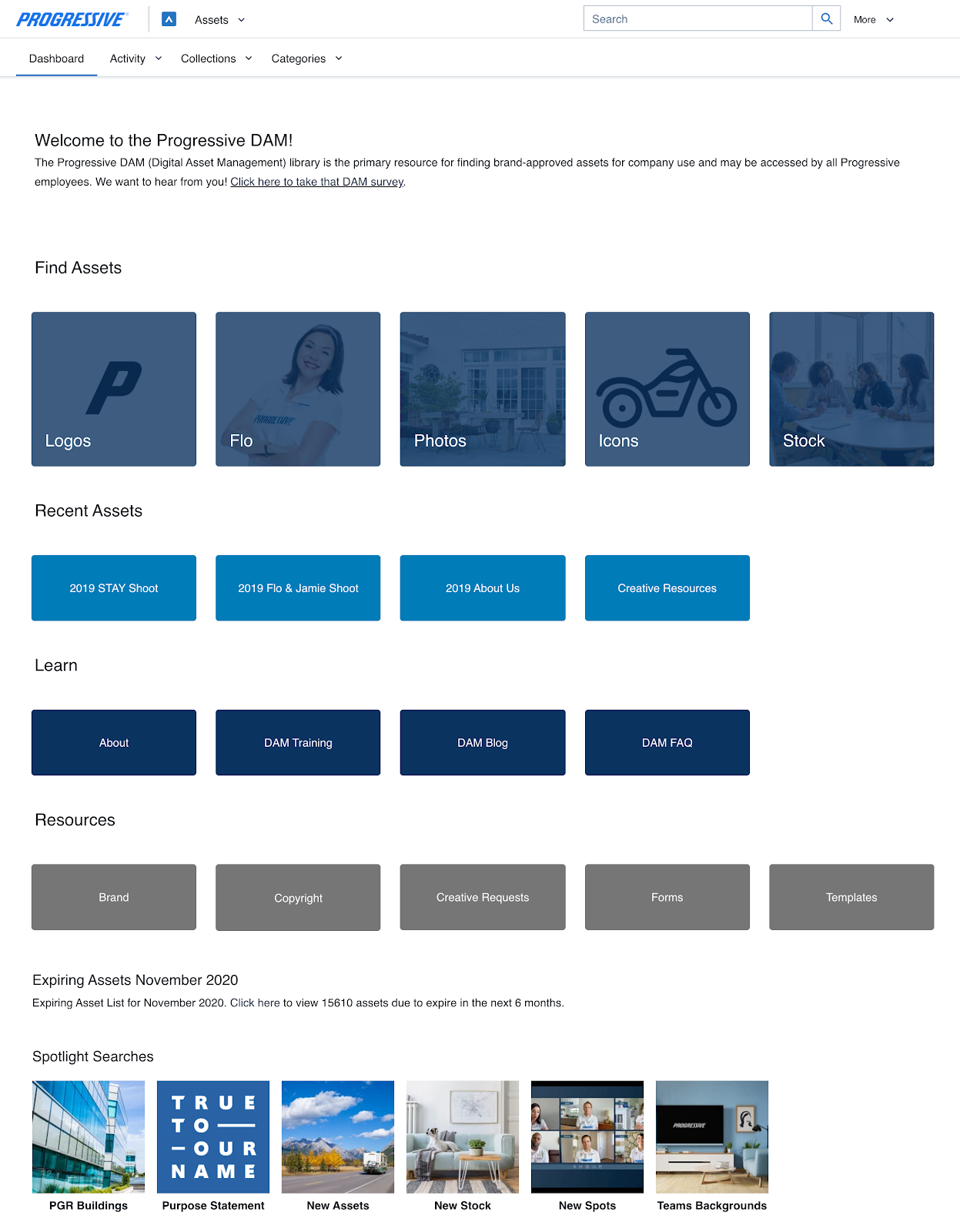
Progressive offers a wide range of insurance choices to customers across the U.S., including auto, home, renters, small business, and more. At the top of their dashboard they’ve placed a message with the mission for their DAM site to establish user expectations. Links to portals, frequently used assets, training materials, and other resources are organized across five columns, and reflect their brand color palette — some with graphic overlays. This coordinated design strategy is simple, pleasant, and successful.
Getting started
All of these dashboard examples combine tools and beautiful visual design to create a user experience that’s both effective and enjoyable. And ultimately, strong dashboard design bolsters user engagement, to maximize the value of your DAM investment.
If you’d like to update your dashboard design but don’t know where to start, this article outlines steps to get it done. Or if you simply don’t have the resources to reach your dashboard goals, consider getting some help from Acquia’s DAM design services. These talented designers can help you create a dashboard that reflects your brand and meets your user needs.
Happy dashboard creating!
Note: This article was originally published on Widen.com.

Manager, Product Marketing Marketing Acquia


